Design and development must go hand in hand. It is elemental for creating products which people will love and use. But, not every day, you see a digital product like Spotify succeed by building a human connection to make users feel valued and infuse a feeling of belonging. Others fail for multiple reasons- one of them is the struggle with design handoff.
The development of a digital product goes through multiple stages. In the design handoff stage, designers handover the designs to developers. They can do it in various ways: using design collaboration and prototyping tools like, Figma, Sketch, Adobe XD, the design specification document, handoff meetings, or a combination of all these. Once done, developers build the final product using these means and the technical specifications.
However, often this transition is not all plain sailing.
As a UX designer working for B2B clients, I was a part of several handoffs and gained valuable insights from them. But before going deep with discussions, let us understand what design handoff is.
Also Read- 5 Things To Consider While Working on UX Design For Startups
What is Design Handoff?
Design handoff is like a relay race where one snag in the passing on of the baton from one athlete to the next can jeopardize the entire run. It is an integral part of the software development process, and a single hiccup here can completely change the outcome. Design handoff actually marks the end of a designer’s role and the beginning of the developer’s part. The process involves delivering specs, clarifying design intention, sharing the context of the user journeys, and strengthening a design system. If you do it properly, then it will simplify the developer’s job.
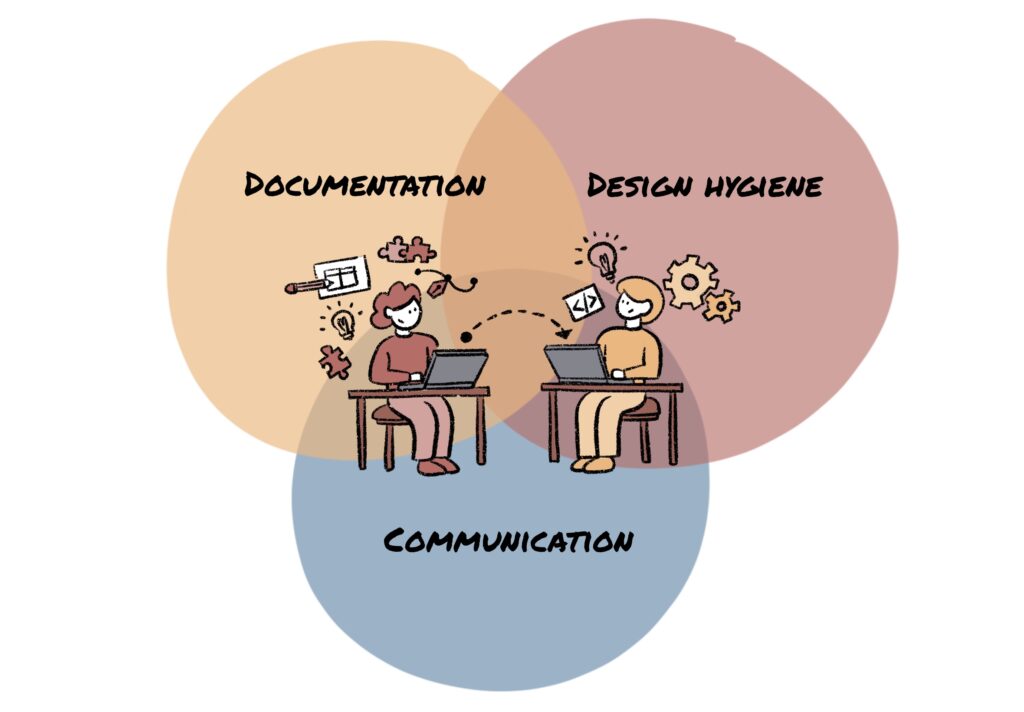
I have identified three key areas where you can initiate changes to facilitate a smoother handoff.
1. Communication
In my first project as a designer, I got to work on a field management app, and that experience taught me why clear communications matter.
We review products once the development process based on our designs is done, and it is a practice ingrained in our process. While reviewing the field management app after the feature implementation, I was a bit taken aback as I noticed some mistakes and remarked to my manager, “The product looks like it was built exactly the way I designed it, but it doesn’t work the way I designed it to.”
A workflow in UX design is a step-by-step breakdown of the course the user will take, and it should never be vague or open to different interpretations. In my case, at first, it seemed like everything was working as expected. But as we tried out navigating through different workflows, we realized they were far from what we wanted to achieve. The developers had done their jobs well, which made me all the more curious. I was getting buzzed in my head with all sorts of questions. What went wrong? Was there a gap between the designs and the tech specs? Were the designs lost in translation during the handoff?
Soon, I got my answer. I realized that communication is crucial not only during meetings but also while designing files and writing technical specifications.
To get past this obstacle, I made some tweaks in my process:
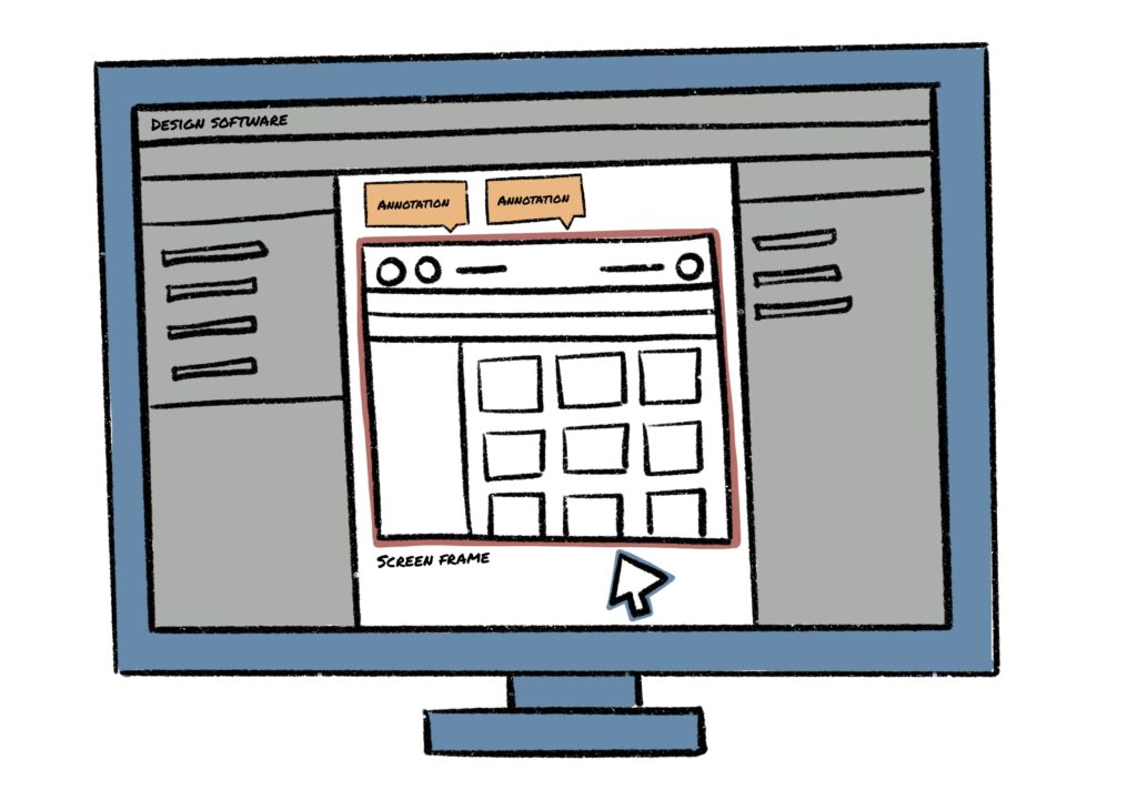
- Started adding annotations and supporting texts to explain design frames and in-between frames.
- Learned more about the process of developers creating a shared vocabulary.
- I always ask the developer what works best for them to get a holistic picture!
When designers are aligned with the developers, getting the right outcome becomes easier. For that, both must work on finding a proper way of communication. We (I and my developer colleagues) prefer texts. You can also think of visual communication, like step-by-step videos.
Miscommunications don’t just give birth to iterations. They can also quickly escalate situations. But if you sort this out with your developers before putting your steps forward, you can prevent any delay in time-to-market.

2. Design Hygiene
Revisions are always tricky. Let me elaborate with an example. Once, we were working on a project that had already undergone development. The first round of user testing yielded some insights that prompted revisions. I made the revisions in the same design file without creating a new version. That was a rookie mistake. As a consequence, my team and I had to struggle a lot to keep track of the changes done before and after.
This oversight caused me to reconsider how I organize my design files. I also realized how important my participation is in the process of developing technical specifications as it ensured that the entire team, including the product owner and developers, could read the design files.
To prevent the same mistake from happening again, I incorporated some changes. Here they are-
- Always create file versions as revisions follow
- Have consistency in design files
- Keep all naming conventions consistent, from components to pages.
- Utilize grids and follow style guides.
- Use time/date stamps if required.
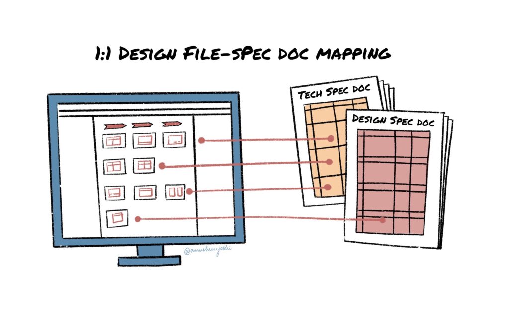
- Do 1-1 mapping of design files and technical specifications.
Good design hygiene can make it easier for non-designers to navigate through design files. This is a must for products where your client does not have a very good understanding of how design files work. It will also cut down the time spent on back-and-forth processes and unnecessary time loss in a handoff meeting.
Also, let us be practical. It’s unrealistic to assume that a product team will remain unchanged forever. New designers and developers may encounter difficulties in understanding a product’s design. However, maintaining good design hygiene can facilitate their transition, making it easier for them to adapt and adopt the design process, and ultimately deliver results more efficiently.

3. Documentation
There’s always scope to learn more about a product from interactions with a client or product owner. We have made these interactions a part of our work culture. Before starting the product development process, we groom the user story by consulting with the product owner and engineering leads to comprehending the requirements fully. During these discussions, we exchange ideas. Once we finalize one, we put that into practice and do revisions if and when necessary.
In one of our projects, after reviewing the prototype at the end of the cycle, we noticed a pattern in our process: we were wasting a substantial amount of time in going back and forth on the same feature-related topics. It was affecting our outcome.
As a countermeasure, we decided to capture the decision-making trail. It slightly changed our objective but got us closer to the goal. Our new objective was to identify and document the reasons that contributed to our decision to pursue a particular idea or not. This prevented our team from getting stuck in a loop.
To implement it properly, I adopted a 4-step procedure.
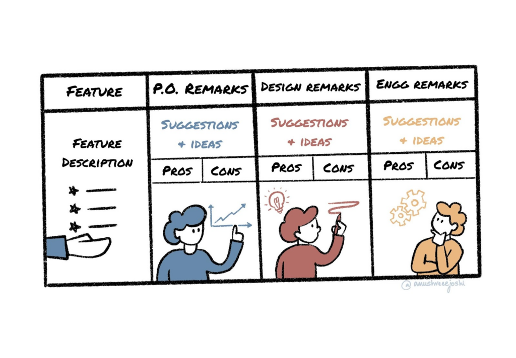
- Capture ideas from the trifecta against the feature being discussed
- Capture the pros and cons of ideas discussed
- Always document revisions and the reasons behind it
- Not only capture but “organize” the Minutes of the Meeting (MoM)
In 2019, Gartner published a report on product managers where they revealed 20% of the 45% of delayed product launches fail to meet internal targets. It happens when plans do not sync, and iterations occur without a goal in sight. Documenting your design steps and brainstorming sessions is an effective way to reduce the number of cases with missing deadlines.

Design Handoff Checklist
Before you start with the handoff process, just confirm that you have ticked off all the pointers of your design handoff checklist.
To make the process simpler for you, I have created a design handoff checklist that you can refer any time.
- Make a high-level flow of the design
- Check out all the possible incidents that a customer may experience
- Review whether you have designed based on priorities
- Create relevant groups and use proper names for your files
- Maintain a consistent naming pattern
- Check the exportability of icons and images
- Provide measurements, pixel specification and color hex codes wherever required.
- Adopt a standard versioning protocol like V1, V2, and so on
- Check the responsiveness of the design if required
- Check the accessibility standard of the design- color contrast, various barriers, legibility, and others
- If you are following a Design System provided by client, make sure to follow the guidelines
- Take help from a writer to remove communication gaps
- Delete all the unused elements and unused guides to avoid confusion
Final Thought

Designer – Developer alignment can be achieved by actively practicing the three elements listed above to ensure a smoother handoff. Without one, the other two might not be as effective. After all, both the engineers and the designers are working on the product with the same goal in mind: to make a unique solution that will meet the company’s goals and make the lives of its users easier.
Ready to optimize your collaboration for exceptional outcomes? Explore our UI/UX design and development services at Talentica.


